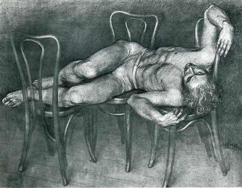
 Paul Cadmus Male Nude Paul Cadmus employs negative lines for his risque paintings and drawings of nude male figures. Brightening a subject with white lineal curves through the body and contrasting that with heavy contours and dark shadows, gives the figure an luminosity and glow that wouldn't be achieved if drawn with positive lines.
|
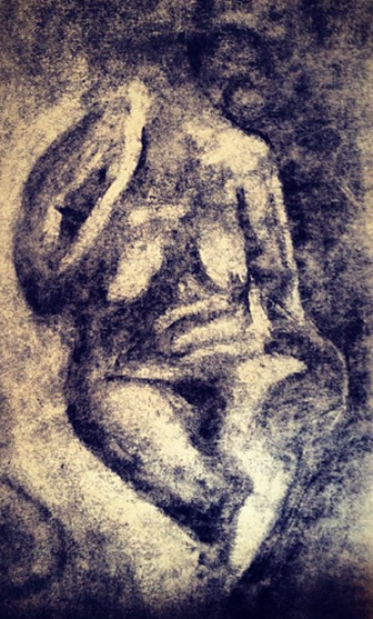
The principle of western lighting convention was not applied in this image. The natural light source from the central right hand side, that was cast on the live model, was exhibited on paper to show the curvacious form in its true light. The direction of light used in this image is the natural way Arabic cultures are accustomed to illuminating a subject, and on occasion can be hard for westerners to believe the image, due to their left to right reading cultures. This image however, I feel, is still convincing as a 3D form without the use of the convention.
On charcoaled paper, an eraser was used in a circular motion to carve the human figure as a negative object, onto the page. With a coherent use of transitional tonal contrast from subject to ground and light to shade, I wanted to challenge the common notion of negative objects making for a more ambiguous space or form.
The exotopic tones on the lit side of the figure have been enhanced with flying whites to communicate with the subject. These flecks of light heighten the dark shadows of the background and show a illuminating light source fanning in from the right hand side, that invites the viewer to ponder what the woman is facing.
In this image, only the simplistic tones of the figure are exploited, and the point of intersection of shadow and light textured. The lineal contour on the shadow side of the figure has been heavily phrased to create weight. Having the two tone contrasting effect within the image, gives the composition an unintentional posterisation or blocking in effect with only the tonal contrast accentuated in the mid tones. This simplicity has achieved an element of visual democracy and gestalt in the composition, it is a soft, feminine stance where no part of the image overpowers anything else.
|
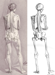
| | "An écorché visually constructed to show the muscles of the body without skin. Renaissance architect and theorist, Leon Battista Alberti recommended that when painters intend to depict a nude, they should first arrange the muscles and bones, then depict the overlying skin." (Wikapedia, 2013)
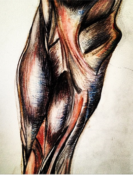
 Andrew Ameral. ECORCHE ASSIGNMENTS I researched more into écorché and Andrew Ameral in particular, who focuses on live models. His work ensures that skeletal and anatomical factors properly align with the figure drawn and match key visual points found on the living.
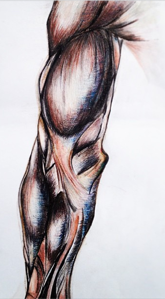
The frontal plane of the arm was drawn to capture the organic uneven look that muscles have that is not present in a lot of anatomy drawings.
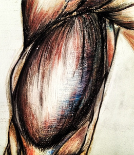
In the convex shape of the bicep muscle, I used warmer tones to create the illusion of bulging as well as dark tones at the edge, gradually lightening towards the centre so the form advances from the page.
Complying with the principle of colour in shadows, the half tones of the muscular form are detailed. I have kept a consistent skin colour bias throughout the image, this local colour is warmed into the light and cool hues are immersed within the shadowed part of the form. These aspects of cool tones are introduced into the shadowed areas following the western lighting convention, as the form is lit from the top front left.
As well as the colour variations within the form, a consistency of mark making has been employed through the arm, creating contrast between light and shade.
In the lit areas, fine vertical lines have been used to signify the natural shape and flow of the ligaments in the subject. In the shadow areas, the majority of the rendering direction is horizontal to exaggerate contrast and the illusion of spacial depth.
|
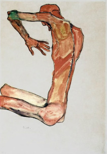
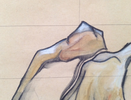
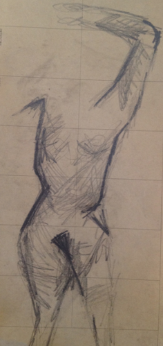
| | This composition started from the live drawing pose where a haptic style and weighted umbre principle was applied. The original pencil lines, still evident throughout the image, were the starting point to develop this pose. Even though the initial lines had meaning and purpose, I attempted to treat them as an analogue, which i then used to configure my subject and new pose to. Using the ambiguous lines of the multiple poses drawn in the live drawing class, I started to manipulate and distort the body and join up the lineal marks to create limbs. This achieved warped angular aspects of my figure, conveying a sense of awkwardness and uncomfortableness in the pose.
Egon Schiele uses analogues within his images. He configures his subjects to fit painful poses and applies sharp lineal contours and phrasing of line to show sometimes almost impossible balancing acts.
 Egon Schiele . Howdy Uni! | | |
I have used Ingres principle throughout the form. Phrasing the lines in relation to the curve and transitional changes throughout the form. Evident on the shoulder, the line within the outer contour is smooth and delicate to portray the muscular aspects. Whereas the pronounced and jagged edge of the shoulder point is used to show the boney structure.
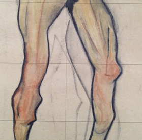
To achieve a sense that the knees are advancing in the composition, I have chosen to introduce warm colours in this section, in hope of achieving pictorial depth in the image.
I have introduced a hint of cool blue on the inner part of the subjects right knee, this colour interaction is simultaneous contrast and is applied to intensify the warm advancing colours and achieve more of an overall unified and balanced image.
|
| |
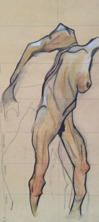
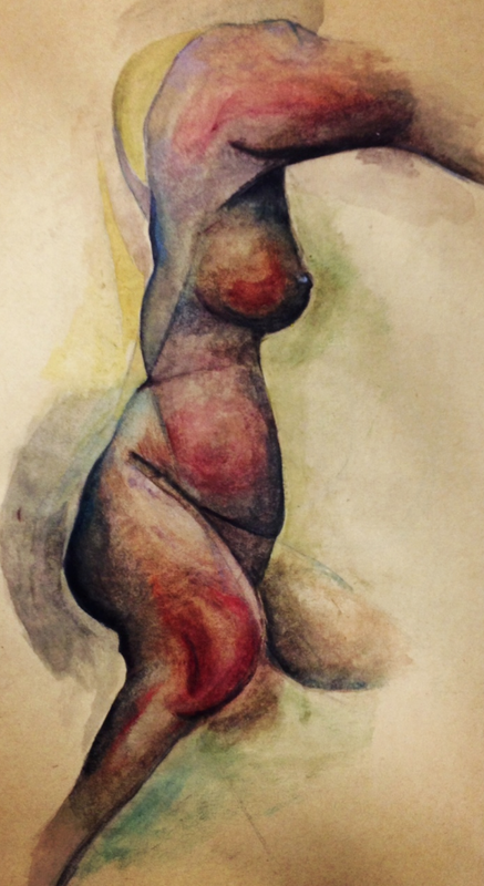
This drawing was elaborated from a haptic 5 critical line exercise. I further developed the image, trying to mimic the stance of the model from only 5 simple lines i had drawn when the model was in the pose.
In conjunction with manufacturing the endotopic tones of the figure to create realism, I have kept the simplification of the five essential lines visible, to depict the natural elegance of the initial stance. It has achieved a subtle superimposition of analogue on the subject, demonstrating the initial experience of feeling out the form in the live drawing class.
Following the weighting principle, the phrasing of the line is thickened towards the bottom and shadowed areas of the figure, to depict where the weight is within the composition. I have avoided using any harsh rendering styles, instead I have treated the surface of the figure with smooth transitions from light to shade, employing a consistency of mimetic marks to depict the textual elements of skin.
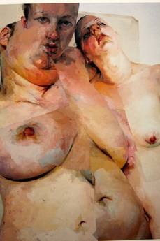
 Ruben's Flap, by Jenny Saville Jenny Saville was an inspiration for this particular work, and for a lot of my elaborations of live drawing sketches. Her intimidating large-scale paintings of voluptuous naked women command presence, oozing elegance and femininity.
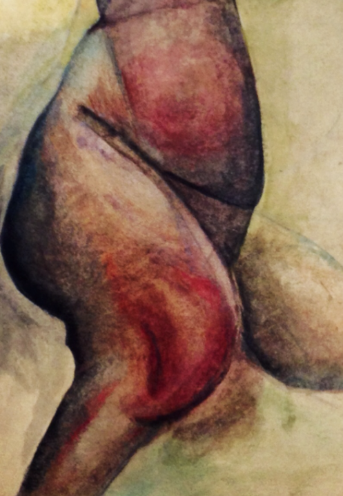
In the section of the females knee and also her breast, a warm red hue has been introduced, the image as a whole was quite dark already, so an intense colour was needed to allow these parts of the image to advance and impose on the viewer.
|
original image
digitally enhanced
|
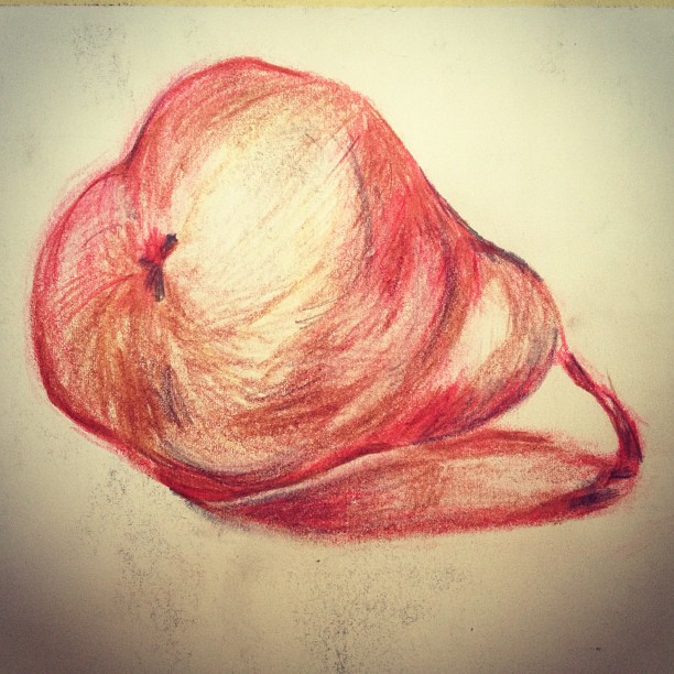
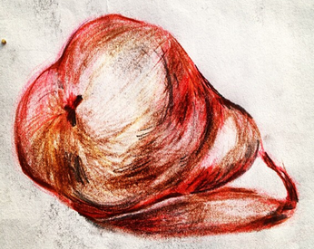
The image of the pear was focused towards techniques of phrasing of line, tone and texture to portray weight. There is a transition of the line from a pale tone at the top rounded area of the pear with an introduction of accents of dark tones towards the ground. Varying the degree of light and shade in the lines of the drawing, depicts heaviness and aids in creating the correct perspective, consequently, connoting the sensation of gravity with the pear sitting in a harmonious position in space.
On the underside of the pear, noetic space has been introduced to portray spacial separation between the subject and the ground. This was done to give an illusion of depth and a 3D form to the image.
A warm colour pallet was used, as well as dark tone on the outside and lighter in the centre. This technique was employed to heighten the illusion of bulging of the convex shape of the pear. When the image was further digitally enhanced, the tonal transitions and colour pallet were made more vibrant to accentuate the contrast from light to dark hues and give prominence to the weight and roundness of the pear.
Following the principle of tonal transitions within the shadow, the inside of the shadow (Antumbre) has been illuminated. The direction of rendering is predominantly horizontal in the shadows, in comparison to curved mark making on the pear following the natural convex shape. The lines are crisp a profound closest to the pear and they gradually soften towards the centre as they recede away from the subject casting the shadow (umbre).
|
 image 1  image 2 |
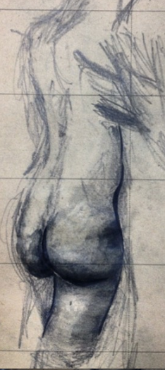
This couplet of images were composed using the principle of parallel scribble gesture. When sitting in a live drawing class, I found angles within the form, and established where these angles were repeated. This tension is shown in the hips of both figures and echoed through the underarm and elbows.
The composition was kept simple, but demonstrates a clear and cohesive understanding of the human form even through this simple haptic approach.
In image 1, I have changed mediums for the final layering of tone for the bottom and legs. The process of merging from the vibrant opaque medium and gradually becoming transparent as we move up the back towards the light, creates spatial depth in the image. The medium of willowed charcoal was swapped to oiled charcoal and ink to create a natural contrast in opacity perspective in the image. In this image, the single point around the bottom and thighs is in focus, and the focus resolution gradually deteriorates leading away from this area. This is simultaneous vision, naturally experienced when an image is viewed through two eyes.
Image 2 has darkened lines on the hip and inner thighs that demonstrates the weight and angular tension of the areas. The change of pressure of the marks creates vignette in the image, there is a loss of clarity from the alteration of rendering towards the corners and edge of the image, but emphasis is still applied to the harsh angular aspects of the boney features and phrasing of line, even in the more transparent areas.
|
|
